Although the design of improper medical products is not always associated with errors related to medical products. Research on users has shown that the lack of adequate training accounts for 70% to 90% of the causes of such errors. But even if these responsible persons may have been "punished", there are still other factors that cause harm to the patient. One of them is that improper human-machine interface design is often hidden in conventional medical work and medical equipment. In the process of bringing disaster to unsuspecting doctors and patients. The direct relationship between medical devices and users is the human-machine interface of medical devices. The advantages and disadvantages of man-machine interface design are related to the reliability of medical devices and the safety of patients.
1, the meaning of the human-machine interfaceThe interface between people and products is called “human-machine interfaceâ€. The human-machine interface is between the user and the product system, and is the medium for transferring and exchanging information between people and products. The interface of the product exists in the information exchange of people-materials. It can even be said that as long as there is a design interface in all areas where the information exchange of characters exists, its connotation elements are extremely broad, reflecting the relationship between the characters.
The development of human-machine interface design theory organically integrates the theories of various related disciplines, constantly improves its basic concepts, theoretical systems and research methods, and forms a comprehensive marginal discipline with a wide range of research and application. Human-computer interface science includes computer technology, psychology, ergonomics, design art, sociology, and anthropology, covering computer, industrial design, new media, psychology, sociology, and anthropology. academic area.
The human machine interface includes components that are in use, ready to use (such as school teams, settings, and open), or all of the human-related components of the device that are maintained (eg, repaired, cleaned). It includes hardware such as switches, buttons and knobs that control the operation of the instrument, including indicators, displays, audiovisual alarms, etc. It also includes a series of logic that guides the system in how it responds to user commands, including how and how When, and in what form, the information is fed back to the user. An important aspect of the human-machine interface is what logical information display and control behavior is consistent with the user's capabilities, expectations, and most likely behavior.
2. Human-machine interface design of medical devices2.1 Arrangement and design of control/display devices for medical devices
Many medical devices have large consoles, a row of control buttons, and display devices. Designers should consider the user's ability to quickly and efficiently identify control, power, and display buttons; contact and accurately set control; accurately read display information; and associate control with related displays. Satisfactory brush strokes include an effective combination of control and display functions, clear and unambiguous logos, and very easy to operate buttons. Clear instructions and effective alerts are also important. Unfortunately, there are many examples of errors in the design of control and display devices. The design errors mentioned below are all present in the design of an anesthesia machine of a certain brand.
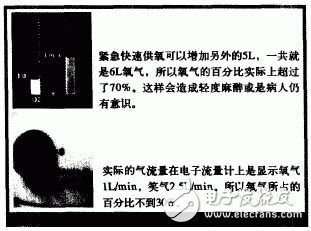
As shown in Figure 1, the anesthesia machine has a rotary switch under the oxygen nozzle that adds 5 L of oxygen per minute to the fresh air flow. It is used as a rapid oxygenation in the event of an emergency or power failure. The extra oxygen flow is not displayed on the electronic flow meter. Inadvertently touching this switch can cause mild anesthesia, so more visible hints should be given, such as on the display.

figure 1
As also shown in Figure 2, the anesthesia machine has three main knobs for setting the mode of the ventilator. The setting is moved from the lower right to the left of the control panel, which does not meet the user's usage habits. Because most of us read the line of sight moving down to the right, just like we read books.

figure 2
This example illustrates the fact that some seemingly small design mistakes can cause very serious problems. The development of relevant human factors guidelines for medical devices can reduce the occurrence of such problems. The following are the design guidelines for the human-machine interface of the medical device design.
As much as possible to ensure that all aspects of the design and user expectations have been. Take into account the user's previous usage habits and established usage habits.
When designing the work platform, control, and display sections, make them consistent with the user's capabilities. These abilities include physical strength, sensitivity, memory, vision and hearing.
Carefully organize the arrangement of the controls and display sections and ensure that the correlation between control and display is very obvious. These conveniences can appropriately reduce the memory burden of the user.
The intensity of the auditory signals is determined so that they are very easy to hear by the medical user. And consider the role of environmental noise.
Ensure that the visual signal is strong enough to be received by the user under various ambient lighting conditions. Similarly, the intensity and color distinction of light can also help to optimize recognition.
Make sure the logo and display are easily visible at a certain angle and distance. The size, contrast, color, and depth of the label should be carefully considered.
Make sure that abbreviations, labels, text, and acronyms are noted or displayed, and that the use of the medical device is consistent with the instructions in the manual. If possible, they should all be consistent with standard terminology.
The design of the control switches and knobs should be consistent with the user community's habits (depending on the user's learning and existing medical device standards).
2.2 Software design of therapeutic machinery
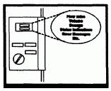
In the case of multiple control and display components, the user must identify and integrate a number of separate pieces of information. The trend now is to add more functionality to the software, which can reduce the number of control and display components, but this will also increase the burden on the user in another way. As shown in Figure 3, there is too much input in a small display. Although there are few control and display components on the panel, a large amount of information shows a high demand on the user's memory. A large amount of information must be recalled in order, thus preventing users from observing other relevant data at the same time. If there are not enough tips and indications, the user becomes lost in the information system. Similarly, without accurate functional status feedback and prompts, users may misunderstand the displayed data or make an incorrect response.

image 3
Many of the usage errors caused by software design are attributed to other relevant factors, because these errors are difficult to be clearly remembered and discovered during analysis and correction. Again, software-related errors are subtle. For example, users are frustrated by inconvenient data entry steps, and then the user makes some mistakes, although these errors are not directly caused by these bad input steps. Unclear command structures and acronyms or omissions of menus can also cause serious errors. There are also relevant design guidelines for overcoming such problems, as follows:
Maintain uniformity in the use and design of titles, defaults, icons and forms to overcome ambiguity.
Make sure the user knows the current state of use of the medical device.
Provide timely and clear feedback when the user operates.
User prompts, menus, and other information should prompt the user to consider the most important steps, rather than “shelving†the user.
Provide users with sufficient resources to provide clear correction and repair guidelines when errors occur.
Don't provide unformatted, intensive or too brief information, because it will confuse users and increase their burden.
Use acceptable symbols, icons, colors, and defaults to deliver information efficiently, cost-effectively and quickly.
When simple hardware solutions are available, don't rely too much on software. For example, using a single button can achieve timely and effective functions.
A separate display section is provided for various information of high importance. In this case, do not display other data in these sections.
Pvc Switch Box,Electrical Switch Box,Pvc Modular Switch Box,Electrical Pvc Switch Boxes
FOSHAN SHUNDE LANGLI HARDWARE ELECTRICAL CO.LTD , https://www.langliplastic.com
